
Vertigo 101
AI Experiments: The use of color in Vertigo

A Splash of Color in a Master's Palette: Hitchcock's Chromatic Vertigo
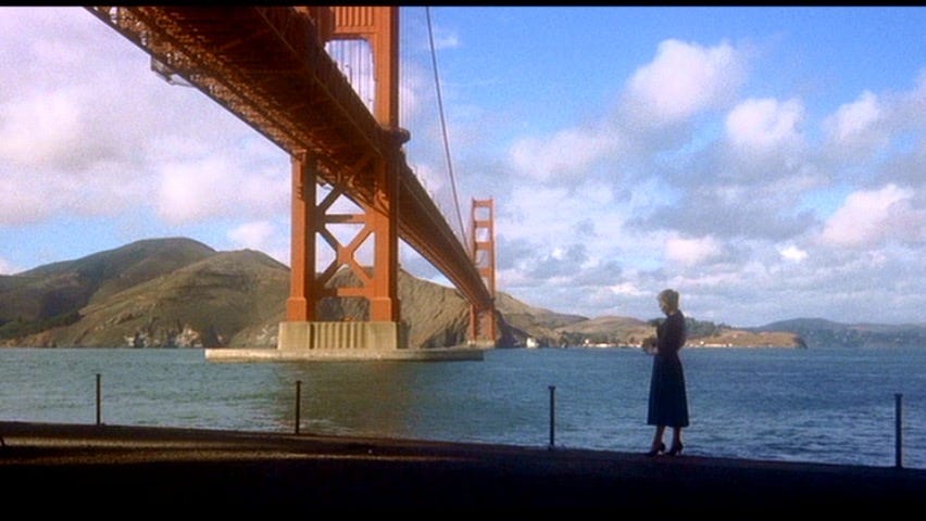
Alfred Hitchcock, the master of suspense, wasn't just a dab hand at crafting nail-biting narratives. He was also a meticulous visual storyteller, weaving color into his films like threads in a tapestry, each hue adding depth and dimension to the cinematic experience. In his 1958 masterpiece, Vertigo, color becomes more than just a visual treat; it's a psychological tool, twisting and turning with the plot, mirroring the characters' emotions, and ultimately blurring the lines between reality and illusion.
**Red: A Sign of Scottie's Descent**
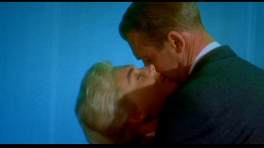
Hitchcock bathes Scottie Ferguson, our acrophobic detective, in a world of vibrant reds. His apartment walls, his car, even his bathrobe are stained with this passionate color. It's a potent symbol of his inner turmoil, his repressed anger and desire, simmering just beneath the surface. When Scottie's vertigo flares up, the red intensifies, bleeding into his nightmares and hallucinations, a visual manifestation of his fear and loss of control.
**Green: The Elusive Madeleine**
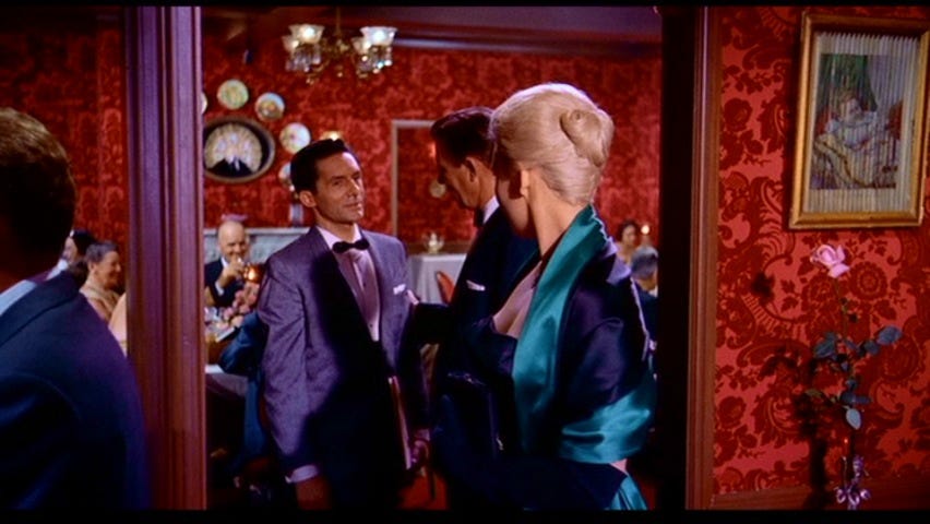
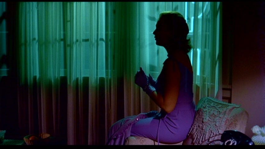
Madeleine Elster, the enigmatic object of Scottie's obsession, is draped in cool, verdant greens. Her dress when they first meet, her car, the shady gardens she frequents – all awash in this mystical hue. Green represents her alluring mystery, her connection to the natural world, and the potential for danger lurking beneath her beauty. As Scottie spirals deeper into his obsession, the green around Madeleine takes on an almost spectral quality, blurring the lines between reality and her fabricated persona.
**Beyond the Binary: A Spectrum of Emotions**
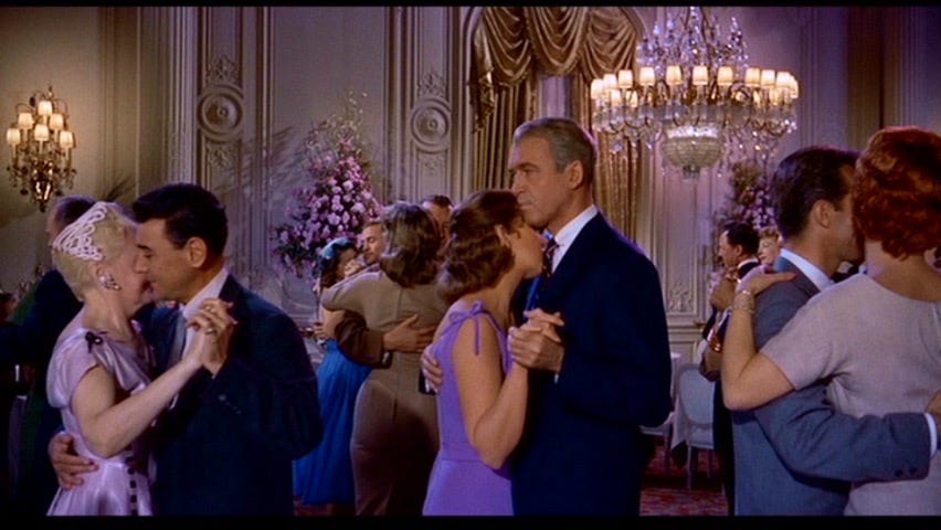
But Hitchcock's brilliance lies in his nuanced use of color. It's not just a simple red for passion, green for mystery. He plays with shades and tones, creating a spectrum of emotions within each color. A pale green can signify innocence, while a deep emerald hints at hidden depths. A muted red might be melancholy, while a fiery scarlet screams with rage. This complexity mirrors the characters' inner lives, their multifaceted personalities that refuse to be confined to neat color-coded boxes.
**Color as a Plot Device**
Hitchcock doesn't just use color to reflect emotions; he uses it to manipulate the audience, too. When Judy, the woman who bears an uncanny resemblance to Madeleine, appears, she's initially dressed in yellows and browns, a stark contrast to Madeleine's greens. But as Scottie tries to mold Judy into his lost love, her wardrobe shifts, incorporating greens and blues, a visual echo of his obsession's insidious grip.
**The Final Twist: A World Bleached of Color**
In the film's final act, as Scottie confronts the truth about Madeleine and himself, the vibrant colors fade. The world turns gray and muted, reflecting the emotional desolation Scottie faces. It's a powerful use of color to mirror the character's psychological state, leaving the audience with a lingering sense of unease, long after the credits roll.
Vertigo is not just a film; it's a chromatic masterpiece. Hitchcock's use of color is not merely decorative; it's an integral part of the storytelling, weaving a web of emotions and illusions that keeps the audience captivated until the very last frame. So, the next time you watch this classic, pay attention to the colors that dance across the screen. They're not just there to be pretty; they're the brushstrokes that paint the soul of the film.
ChatGPT 3.5 was used to create this post.
Excellent research on your part.